How confident are you that you take prescription drugs correctly? The instructions on the bottle's label may not seem to be hard to follow, but more than 500,000 Americans misinterpret them every year.
We wanted to do a "spot check" and see for ourselves how different drug labels, bottle warnings, and consumer drug information leaflets compared with one another. So Consumer Reports staffers filled prescriptions for 5 milligrams of warfarin at five chain pharmacies near our offices in Yonkers, N.Y.: Costco, CVS, Target, Walgreens, and Walmart. The drug warfarin, also known by the brand-name Coumadin, is a commonly used generic blood thinner, which can cause dangerous bleeding if taken incorrectly.
Given the known dangers with this medication—it's the second most common drug linked to emergency-room visits in the U.S.—we expected fairly clear and moderately consistent warnings and instructions across all the prescriptions. Instead we found critical information that was confusing, misleading, buried, or absent.
While the findings are not nationally representative for each chain, they do provide a glimpse into common issues consumers may face. Prescription drug bottles had an array of instructions and warnings—or alarmingly, as in the case of one store, no warnings at all. (In another visit, that same store did include warnings on the bottle. A third prescription we filled at a different store in the same chain also included warnings, but valuable label space was also used to print the lunch hours when the pharmacy was closed.)
We also found additional drug-safety information stuffed or stapled into pharmacy bags that was difficult to read due to very small type, had inconsistent information about side effects, or was written in confusing medical jargon. And four of the five pharmacies failed to follow a U.S. Food and Drug Administration regulation that calls for including an FDA medication guide with many prescription drugs.
Prescription bottle labels
There are about 1.5 million preventable medication errors each year, according to a 2006 report from the Institute of Medicine. Roughly one-third of those mistakes occur outside of hospitals, where patients must rely upon their own ability to follow the instructions on their medication containers. Studies have found that half of adults in outpatient settings misunderstand at least some of the instructions on a drug's bottle labels. For example, a 2007 study in the journal Patient Education and Counseling found that one-third of patients did not realize that "two tablets by mouth twice daily" meant taking four pills in a 24-hour period.
"Health literacy is a big issue," says Allen Vaida, Pharm.D., executive vice president of the Institute for Safe Medication Practices (ISMP) in Pennsylvania. "Even college grads can have trouble when it comes to understanding terms that health-care workers use."
When your doctor scratches a few letters and numbers onto a prescription pad, a pharmacist must then translate those abbreviations into easy-to-understand instructions for you, which are typed onto the patient drug label on the bottle. If your doctor instructs you to take a drug twice a day, for example, the pharmacist can choose to write "twice a day," "every 12 hours," "once in the morning and once in the evening," or similar instructions.
But "patients do better with more specific directions," says William Shrank, M.D., an assistant professor at Harvard Medical School who studies the effectiveness of patient drug labels.
Language like, "1 tablet in the morning and 1 tablet at night, 12 hours apart" helps patients understand when they should take their medication , rather than the vague "twice a day," which isn't associated with any time frame. That can cause some people, for example, to take the drug at say, 9 a.m. and then again at 3 p.m., then wait another 18 hours until they take another dose.
Why is there so much variation on prescription drug labels?
Part of the problem is that there's no nationwide standard, unlike the Nutrition Facts labels on food packages or the Drug Facts labels on over-the-counter medication. Although the Federal Food, Drug, and Cosmetic Act requires certain details to appear on bottle labels (like the patient's name and dosage instructions), other details can vary by state. The labels aren't monitored by the Food and Drug Administration; rather, each state's board of pharmacy is responsible for their content.
Most chain pharmacies send patients home with pages of instructions and warnings about the drugs, but a 2008 FDA study suggests that this literature usually isn't helpful. Some research has found that the majority of people don't read it completely because the language is too complex. Most patients rely on the information printed directly on their medication containers, which is why having an easy-to-read label and warnings is so important.
The U.S. Pharmacopeia, the authority that sets voluntary standards for prescription medication, and the Institute for Safe Medicine Practices recently suggested that it's helpful to patients when labels contain:
- Words typed in easy-to-read 12-point type, with the patient's name, drug name, and drug instructions in the largest letters. But not all pharmacies follow this suggestion. Harvard researchers who studied dozens of patient drug labels found that the words that are often the most prominent on labels pertain to the pharmacy itself, not drug information.
- Warnings typed directly onto patient labels in a large typeface. Research has found that fewer than 10 percent of people examine their drug containers for the colorful warning stickers that sometimes appear on the bottle. And warnings that appear on the labels that are typed in very small type can be hard to read or hard to find.
- The generic and brand name of a drug. This might prevent someone from mistakenly taking a double dose of the same medication prescribed by two doctors and filled at two different pharmacies, one as the generic version and one as the brand-name drug. Filling all of your prescriptions at the same pharmacy helps you avoid accidental mix-ups like this.
- Images or physical descriptions of the pills in the container. Someone who reads that he or she should be taking round blue tablets will probably call the pharmacy if there are oval-shaped white pills in the container.
- No extra zeroes (like 5.0 mg), so patients who take 5 mg of a medication don't incorrectly remember it as "50 mg" when talking to a doctor.
- The pharmacy's information—name, address, and phone number—at the bottom of the label, so the patient's drug information is prominently displayed at the top for easy reading.
One pharmacy chain's labels stood out from the pack. Target reinvented their bottles and labels in 2005 to help reduce patient errors. It created triangular containers that stand on their caps, leaving a large area on the front and back for drug-information labels. The drug information is in large typeface, the pharmacy details are small and at the bottom of the label, and there's room for multiple warnings and instructions on the back of the bottles. Target has even incorporated a color-coding system for their drug containers so family members won't accidentally reach for the wrong bottle. The ISMP has given the chain an award for its effective labels, and researchers who study patient labels have also taken notice.
"Target should be commended for their efforts to help patients read and understand medication labels," Shrank says. "I think it represents a dramatic improvement over standard labels."
FDA-approved Medication Guide that is required for certain drugs, including warfarin, that have particularly serious safety problems or other issues. Only Costco got it right. In general, failure to do so is a violation of federal law, and by extension, state law, according to Catizone.
That's a problem, because warfarin is among the most likely prescription drugs to cause serious adverse reactions leading to emergency-room visits, and requires clear guidance. Representatives of Target and CVS told us that their pharmacies automatically print medication guides for patients. But those guides did not make it to our staff members' packages. At press time, Walgreens and Walmart had not responded to our queries.
All of the pharmacies did provide their own patient materials, known as consumer medication information (CMI) - and all the materials included the most important "black box" safety warnings about the risk of bleeding. But, they differed from the FDA-approved guide, and proved confusing even for our health reporters to decipher.
For example, warfarin's possible side effects include life-threatening bleeding problems; skin-tissue damage; "purple-toes syndrome," which can lead to amputation; allergic reactions; liver problems; low blood pressure; swelling; low red blood cells, paleness; fever; and rashes, according to the official FDA guide. But the inserts from Walgreens, Walmart, and Target reported under the heading "possible side effects" that warfarin has "no common side effects (all in capital letters) with the proper use of this medicine." Those inserts instead included a list of serious symptoms and "unusual effects,"—shortness of breath, and bloody stool or urine among them—and followed up with a caveat referring patients to their doctor for information about other possible side effects.
The first side effects listed in the CVS and Costco inserts—nausea, loss of appetite, and stomach or abdominal pain—don't appear in the FDA-required Medication Guide for patients at all. Nausea and pain are listed as infrequent side effects in the FDA's approved drug insert for physicians, and loss of appetite also appears in the medical literature. None of the five inserts list additional side effects that can be caused by warfarin, such as gas, tiredness, hair loss, a change in the way things taste, or chills.
Those mixed messages dealing with risks or serious symptoms on the one hand, and side effects on the other, are confusing for a consumer looking for simple information about side effects. "I'm not sure how [a pharmacy] can provide information below [FDA] requirements, or package it to downplay information that the FDA [has] determined is critical for the patient," Catizone says.
We also found conflicting warnings about alcohol in the inserts. Costco and CVS advised patients to "limit or avoid alcohol." But the FDA-approved Medication Guide and the other pharmacies recommended not drinking at all.
The inserts weren't all bad. All of them included warfarin's important "black box" safety warning that the medicine can cause "severe and sometimes fatal bleeding," and other important cautions. And all had important information on how food, supplements, and other drugs can interact with warfarin. But readability might prevent many consumers from learning about those cautions.
Target, Walgreens, CVS, and Costco printed the inserts in a small type that most patients would have trouble reading. Walgreens' insert is especially hard to read due to very narrow spacing between the lines. And all of the inserts frequently used capital letters for some warnings or headings, which is harder to read, according to FDA guidelines for consumer medical information. Walmart's insert was printed in relatively large type but the information was spread over four pages. Costco's in-house insert was well-designed with clear formatting, but a large red and blue pharmacy graphic over the drug information was a distraction.
Change may be coming. The FDA's Risk Communication Advisory Committee recently recommended that it adopt a standard document for communicating essential information about prescription drugs. Walsh, the FDA spokeswoman, says the "FDA is engaged in a collaborative effort to explore this recommendation." And the 2009 health-reform law asked the FDA to look into implementing a Drug Facts box that would help consumers understand benefits and risks.
If you think you have experienced an adverse event with this drug or any drug, especially if it is of a serious nature, it is important to 1) tell your doctor immediately and 2) report the event to the Food and Drug Administration via the FDA's MedWatch website at https://www.accessdata.fda.gov/scripts/medwatch/medwatch-online.htm or by calling 1-800-FDA-1088.
5 things you can do to stay safe
In the meantime, our medical consultants suggest the following to keep you safe:
- Confirm that you understand the basics of your medication: How much should you take, when, and how often. Take time at the pharmacy counter to talk with the pharmacist. Even if he or she seems busy, don't feel reluctant to ask.
- Ask about food, supplements, and vitamins that should be avoided. And what about alcohol?
- Ask about the possible side effects, both common and rare, as well as which are the most serious.
- Read the patient information sheets that come either stuffed into or stapled to the prescription bottle bag.
- Determine when you can stop taking the medication. Some drugs, like antibiotics, should be taken until they're finished. You might be able to discontinue other medication as you feel better.
A closer look at prescription bottle labels
See below for a detailed analysis of the bottles we received and how they stacked up.
Costco
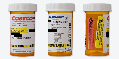
Readability
| Black words on a white label? | Mostly. The Costco logo is red and blue, and the drug name and refill number are highlighted yellow. There are also some very small words, such as "discard after," "Dr.," and a warning against taking someone else's prescription in red type. |
| Typeface and style are easy to read? | No. Although the drug name looks to be in 12-point type (but point size varies between fonts), the dosage instructions are in a lighter, approximately 8-point type, and the colorful warning labels on the side of the bottle have even smaller type. |
| All text horizontal, including warnings? | No. The warnings are on separate, colorful stickers that read vertically, while the text on the patient drug label itself reads horizontally. |
| Drug information separate from pharmacy information? | Yes. |
| Patient name plus address or date of birth appears as an identifier? | Yes. |
| Only patient information is highlighted? | Yes. |
| Drug name is clear? | Yes. |
| Drug's generic and brand names are listed? | No. However, both names were listed in the accompanying paper instructions. |
| Avoids unnecessary zeroes? | Yes. |
| Instructions are written out explicitly? | Yes. |
| Instructions use numerals? | Yes. Instructions say "1 tablet," not "one tablet." |
Safety
| Label has written description and/or image of the medication? | Yes, but the print is quite small and almost unreadable. |
| Warnings are present and well placed? | No. There are no warnings on the patient drug label itself. Instead, there are two colorful warning stickers placed horizontally on the bottle, separate from the dosage instructions, where patients might not look for information. There were also warnings listed in the paper instructions that accompanied the medication. |
CVS
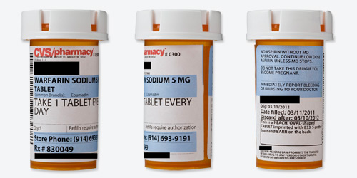
Readability
| Black words on a white label? | Mostly. CVS logo is red text, and the drug name and dosage, warnings, pharmacy phone number and refill number are highlighted blue. |
| Typeface and style are easy to read? | Yes. The words are large, clear, and easy to read. |
| All text horizontal, including warnings? | Yes. |
| Drug information separate from pharmacy information? | Yes. |
| Patient name plus address or date of birth appears as an identifier? | Yes. |
| Only patient information is highlighted? | Yes. |
| Drug name is clear? | Yes. |
| Drug's generic and brand names are listed? | Yes. Although this was filled for generic warfarin, the label says "Common Brand(s): Coumadin." |
Dosage
| Avoids unnecessary zeroes? | Yes. |
| Instructions are written out explicitly? | Yes. |
| Instructions use numerals? | Yes. Instructions say "1 tablet," not "one tablet." |
Safety
| Label has written description and/or image of the medication? | Yes. |
| Warnings are present and well placed? | Yes. They are typed on the actual label (not added as colorful stickers) in clear, simple language. |
Target
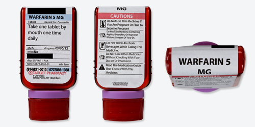
Readability
| Black words on a white label? | Mostly. The Target name is in red type, and the drug name and refill number are highlighted blue. Also, the word "cautions" above the list of warnings on the back side of the label is highlighted red. |
| Typeface and style are easy to read? | The words are large, clear, and easy to read, especially the drug name and dosage across the top of the bottle. |
| All text horizontal, including warnings? | Yes. |
| Drug information separate from pharmacy information? | Yes. |
| Patient name plus address or date of birth appears as an identifier? | Yes. |
| Only patient information is highlighted? | Yes. |
| Drug name is clear? | Yes. |
| Drug's generic and brand names are listed? | Yes. Although this was filled for generic warfarin, the label says "Generic for: Coumadin." |
Dosage
| Avoids unnecessary zeroes? | Yes. |
| Instructions are written out explicitly? | Yes. |
| Instructions use numerals? | No. The label says "one tablet," instead of "1 tablet." |
Safety
| Label has written description and/or image of the medication? | No. But this information did appear in the paper instructions that accompanied the medication. |
| Warnings are present and well placed? | Yes. Most of the rear side of Target's triangular-shaped bottle has warning information. |
Walgreens
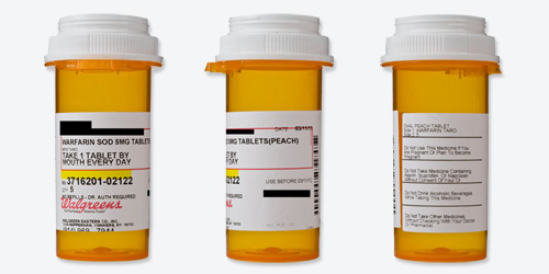
Readability
| Black words on a white label? | Mostly. The Walgreens name is in red type, and the refill number is highlighted yellow. There's also a red box outlining most of the patient information. |
| Typeface and style are easy to read? | Somewhat.The words are fairly large, clear, and easy enough to read, though they could be bigger. |
| All text horizontal, including warnings? | Yes. |
| Drug information separate from pharmacy information? | Yes. |
| Patient name plus address or date of birth appears as an identifier? | Yes. |
| Only patient information is highlighted? | Yes. |
| Drug name is clear? | No. The name "warfarin sodium" is abbreviated as "warfarin sod," which may be confusing to patients. (But "warfarin," the most important part of the name, is spelled out.) |
| Drug's generic and brand names are listed? | No. (The brand name was also not mentioned in the paper instructions that accompanied the drug.) |
Dosage
| Avoids unnecessary zeroes? | Yes. |
| Instructions are written out explicitly? | Yes. |
| Instructions use numerals? | Yes. It says "1 tablet," not "one tablet." |
Safety
| Label has written description and/or image of the medication? | Yes. |
| Warnings are present and well placed? | Yes. |
Walmart

Readability
| Black words on a white label? | Mostly. The Walmart name is in blue type, and the refill number, patient name and patient address are highlighted yellow. |
| Typeface and style are easy to read? | Somewhat. The words are fairly large, clear, and easy enough to read, though they could be bigger. |
| All text horizontal, including warnings? | Text is horizontal but in the case of the warning stickers, it varies. The first bottle has no warnings; second bottle - three warning stickers are horizontally placed; third bottle - two warning stickers placed sideways and one positioned horizontally. |
| Drug information separate from pharmacy information? | Yes. |
| Patient name plus address or date of birth appears as an identifier? | On the first and second bottles, the patient's name is present, but no birthdate or address identifiers (same Walmart pharmacy store). On the third bottle, the patient's name and address are present (different Walmart pharmacy store). |
| Only patient information is highlighted? | Yes. |
| Drug name is clear? | Yes. |
| Drug's generic and brand names are listed? | No. (The brand name was also not mentioned in the paper instructions that accompanied the drug.) |
Dosage
| Avoids unnecessary zeroes? | Yes. |
| Instructions are written out explicitly? | Yes. |
| Instructions use numerals? | No. The label says "one tablet," instead of "1 tablet." |
Safety
| Label has written description and/or image of the medication? | Not on the first or second filling. The third prescription we filled with Walmart had a sticker attached to the bottle with a description of the medication. (The information was not mentioned in the paper instructions that accompanied the drug.) |
| Warnings are present and well placed? | No. This was the only prescription in our survey where a bottle had no warnings at all for warfarin, a drug that can place you at risk of bleeding. But there were warnings mentioned in the accompanying paper instructions. When we filled the prescription a second and third time, warning stickers were attached to the prescription container. |
